
Tags
AH MAckmurdo, Art Nouveau, Doulton tiles, Edward Everard, George Skipper, Norfolk Daily Standard, Royal Arcade Norwich, WJ Neatby
Art nouveau (the new art), le style moderne, Jugendstil (youth style), Secessionism, all refer to the newness of an art that, around 1900, broke away from academic tradition and – in some versions – emphasised the curved line of plant form. But this sensuous, rather decadent, style with its characteristic whiplash line might have had its origins in religious architecture.
Six hundred years earlier the curved line was being used to design the stone tracery decorating the tops of Gothic windows. Instead of scribing complete circles with his compass to produce, for example, the clover-leaf trefoils of the earlier Geometric phase, the master mason of the Curvilinear period would join separate arcs to produce the sinuous S-shape of the ogee [1]. Nikolaus Pevsner described this window below as, “The best Decorated example in Norfolk” [2].
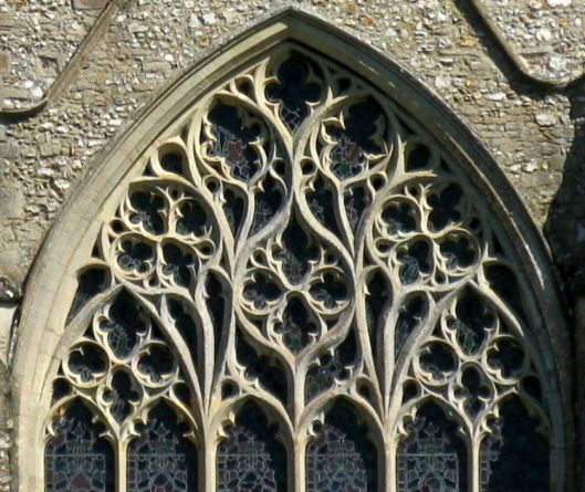
The curvilinear tracery of St Mary Snettisham, Norfolk. Photo: Spencer Means, Creative Commons
Compared to the sinuous line of the English Curvilinear period the continental version seems even more convoluted, reflexing back on itself to produce the flame-like curves of the Flamboyant period.
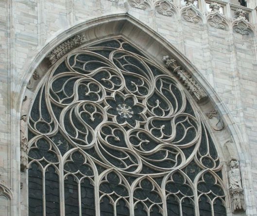
Flamboyant window in Milan Cathedral. Photo: Mary Ann Sullivan
The reversed curve may therefore have been deeply embedded in the architectural folk memory and, in Britain at least, reawakened by the Victorian Gothic Revival. However, the first time that the flexuous line emerged as a recognisably art nouveau design was when this book cover by the English designer Arthur Heygate Mackmurdo was published in 1883. It was, said Pevsner, “the first work of art nouveau which can be traced” [3].
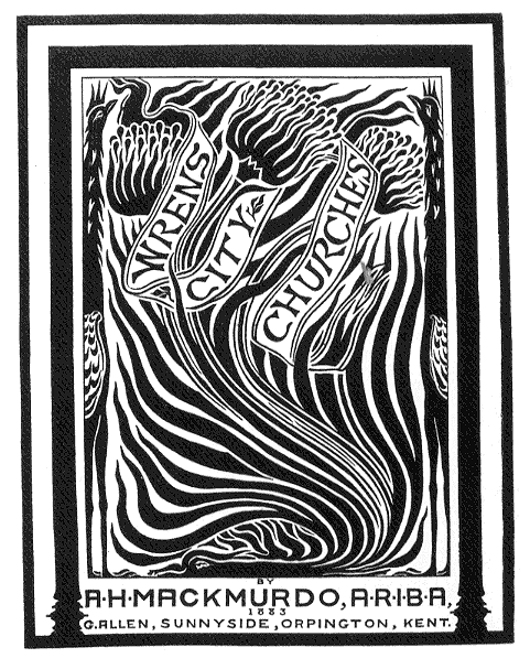
Book cover for Wren’s City Churches by A. H. Mackmurdo 1883.
Norfolk readers may appreciate Mackmurdo’s early Art Nouveau ‘Cromer Bird’ pattern, which used a similar undulating line.
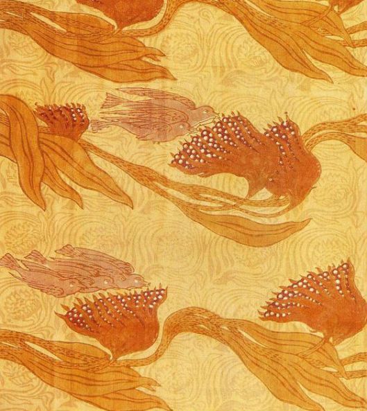
A.H.Mackmurdo 1884. ‘Cromer Bird’ design for block-printed cotton.
In medieval Gothic architecture even the most curvaceous designs of the Curvilinear period remained symmetrical: either radially symmetrical (as in the second figure above) or with left/right bilateral symmetry as in the first example of a Decorated window. But in designing this chair-back Mackmurdo resisted the urge for symmetry.

Mackmurdo chair of 1883-4. The seat and legs are entirely conventional but the fretwork splat is wonderfully asymmetrical – almost a 3D version of the ‘Wren’ book cover above.
The ‘Wren’ book cover might imply that Art Nouveau originated in Britain but in reality the new art was an amalgam of styles that emerged at about the same time across Europe and America. However, Art Nouveau never fully emerged as a dominant architectural style here, perhaps being thought too decadent and sensuous for Protestant Britain. The major exception was in Glasgow where Charles Rennie Mackintosh’s buildings are masterpieces of a new style, although his version was more rectilinear and geometric than these snaking lines displayed in Victor Horta’s Hotel Tassel, Brussels.

Hotel Tassel, designed by Victor Horta, Brussels 1893-4.
Compared to the pent up energy of the whiplash line unleashed in continental architecture the rare examples of Art Nouveau buildings in England appear restrained.
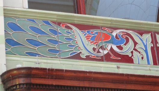
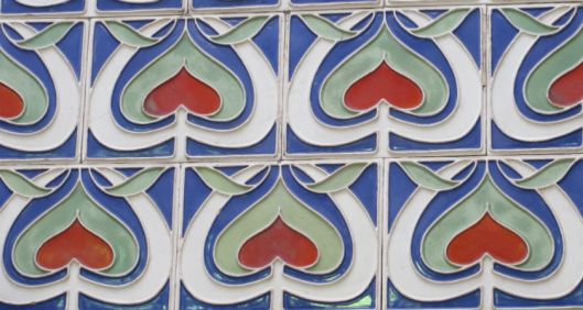
The Royal Arcade in Norwich is a nationally important example…
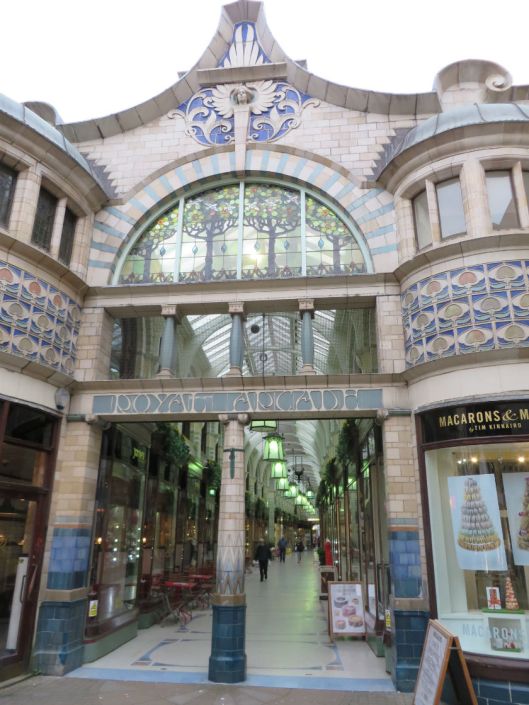
Royal Arcade Norwich 1899. Architect GJ Skipper, designer WJ Neatby of Doulton Lambeth Pottery
The photograph below, taken in 1955, shows the ground floor of the shop that flanked the left entrance to the arcade.
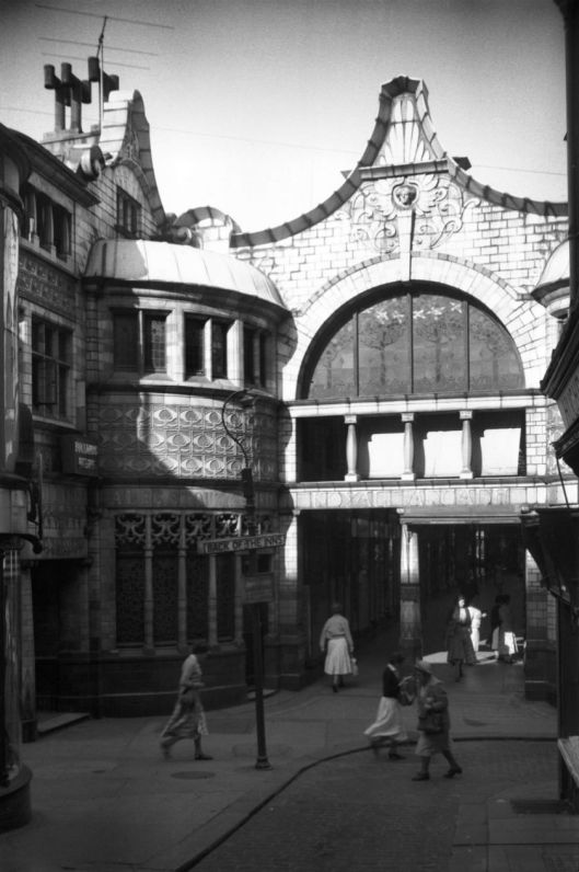
The Royal Arcade 1955 (c) georgeplunkett.co.uk
This shop to the left of the Back of the Inns entrance was known as The Arcade Stores. Originally a Bullards pub, Skipper integrated it into the arcade. Below, we can just make out tiles bearing bunches of grapes (left) but they didn’t survive the destruction of this part of the building when converted to a butcher’s shop in the 1960s (see oldcity.org.uk).
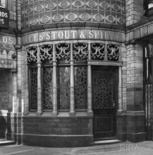
The Arcade Stores 1956. (c) RIBA
Another jewel-like building with polychrome Doulton tiles by the same designer is the Edward Everard printing works in Bristol.
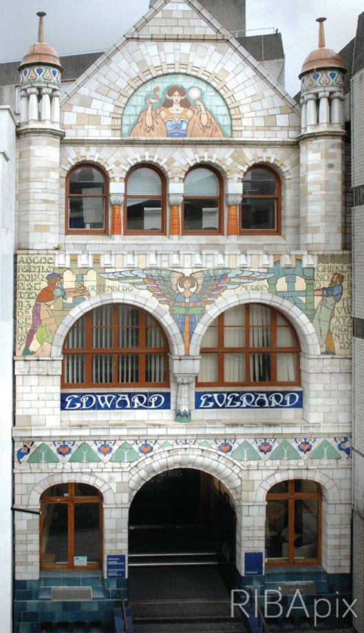
Everard’s printing press Bristol, with tiles by Doulton’s WJ Neatby. Only the facade survives, underlining the relative importance attached to exterior versus the interior (c) RIBA
Both built at about 1900, Everard’s and the Royal Arcade share obvious similarities derived from the Doulton tile designer William James Neatby. The figure to the left of the first floor windows of the printing works is the inventor of the printing press Johannes Gutenberg: to the right is William Morris who revived the art of printing with his Kelmscott Press. This in turn has resonances with another building by George Skipper in Norwich, The Norfolk Daily Standard offices in St Giles Street.
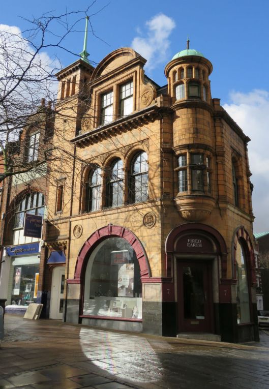
Norfolk Daily Standard offices (1899-1900), architect George Skipper.
This Skipper gem is decorated with Doulton brown terracotta tiles. Although there are minor Art Nouveau touches it is not really an example of that movement for its influences are more eclectic [4]. But, recalling those two figures of pioneers on the Everard building (and the tendency of architects to borrow a good idea), the Norfolk Daily Standard building bears portraits of William Caxton (the first English printer) and Daniel Defoe (one of the first English journalists and novelists).
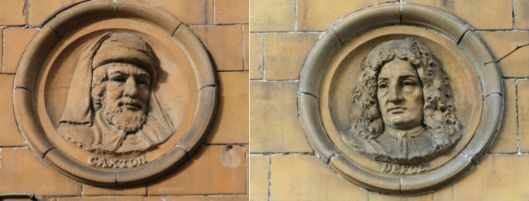
William Caxton (printer) and Daniel Defoe (writer) decorate the Norfolk Daily Standard building.
These newspaper offices and the Royal Arcade are prime examples of Skipper’s imaginative buildings, designed about 1900, that brought a modern dimension to the largely medieval and Georgian-style city. As Sir John Betjeman said:
“He was to Norwich what Gaudi was to Barcelona”
Betjeman probably had his tongue firmly in his cheek when he compared Norwich and Barcelona but, don’t forget, Skipper was big in Cromer too. [5]
It was Neatby’s colourful tiles rather than the underlying architecture that caused the press to say the arcade was like a “fragment from the Arabian Nights dropped into the heart of the old city” [6]. At that stage, Neatby had been Head of Doulton’s architectural department for about ten years.
Sir Henry Doulton (d 1897) made his money from the manufacture of glazed stoneware drainage pipes at a time when there was an increasing demand for better sanitation. By 1870 the same clay used for sewage pipes was being used by students who came to his workshop from the nearby Lambeth School of Art to produce what became the enormously popular Doulton Art Pottery.
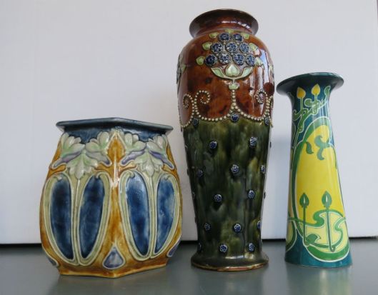
Left, A Doulton slip-cast stoneware vase in which the pattern is applied by the mould. Centre, a Doulton stoneware vase that has been turned on a wheel with the pattern applied by hand. Right, a transfer-printed, hand-painted vase (factory unknown) showing the more continental whiplash line.
Neatby was an experimentalist and he helped develop Doulton’s Carraraware, a dense white body made to look like marble [7] that was used to clad the external facing of the Royal Arcade.
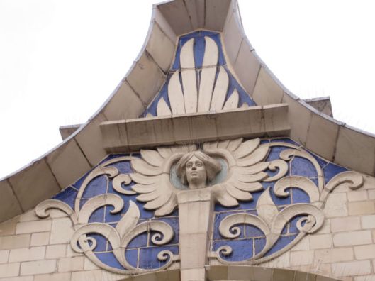
This winged angel guarding the east entrance to the Royal Arcade is a reference to the Angel Inn that once stood on this site [4].

Neatby’s side entrance to the arcade – Parian ware with a raised sinuous line.
Some particularly attractive tiles are found in the spandrels of the central arches. These panels depict a young woman holding a circle that, in original illustrations, contained a sign of the zodiac [7].
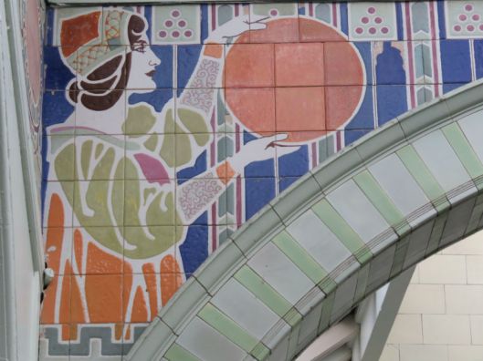
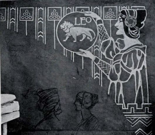
Neatby’s working cartoon for the Royal Arcade tiles. From the Proceedings of the Society of Designers c1900.[8]
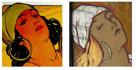
The image is strongly reminiscent of the women illustrated by Alphonse Mucha in his lithographic posters; for instance Salome (below), published two years before the Royal Arcade was opened. Mucha’s free-hand drawings for his lithographs use a detailed, sinuous line but Neatby’s freedom was restricted by his medium: he had to pour enamel glazes into indentations impressed into the mould as it was formed [8]. An early article noted, “Everyone knows that enamel painting on pottery is not so ‘go as you please’ as oil or watercolour painting … the actual technique (is) exceedingly difficult” [9].
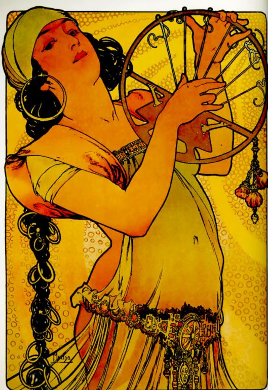
‘Salome’ by Alphonse Mucha, 1897 (c) backtoclassics.com
Postscript
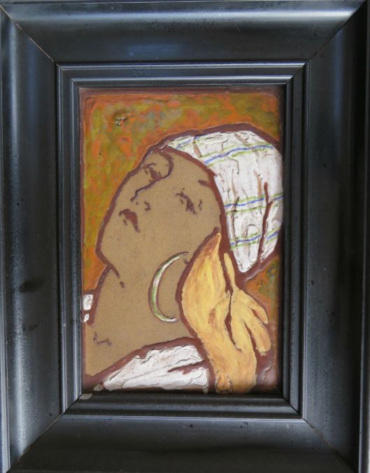
Many years ago I bought a framed tile in a junk shop in Cambridge. The buff-coloured sanitary-ware tile, impressed with ‘Doulton’, was illustrated with the head of a young woman. Much later I realised she was based on Mucha’s Salome, but flipped left/right.
Sources
- Harvey, John (1988). Cathedrals of England and Wales. Pub, Batsford Ltd, London.
- Pevsner, Nikolaus and Wilson, Bill (1999). The Buildings of England, Norfolk vol 2. Pub, Yale University Press.
- Pevsner, Nikolaus (1975). Pioneers of Modern Design. Harmondsworth: Penguin Books.
- Bussey, David and Martin, Eleanor. (2012). The Architects of Norwich: George John Skipper, 1856-1948. Pub, The Norwich Society.
- Hitchings, Glenys (2015).George John Skipper (1856-1948). The Man who created Cromer’s Skyline. Pub, Iceni Print and Products. [Available from City Bookshop Norwich http://www.citybookshopnorwich.co.uk]
- Salt, Rosemary. (1988). Plans for a Fine City (Victorian Society East Anglian Group, Norwich).
- Atterbury, Paul and Irvine, Louise (1979). The Doulton Story. A souvenir booklet produced originally for the exhibition held at the Victoria and Albert Museum London 30 May- 12 August 1979.
- http://tilesoc.org.uk/tile-gazetteer/norfolk.html
- https://www.fulltable.com/vts/aoi/n/neatby/a.htm

Thank you, Reggie! Thanks to you Maarten&I enjoy ‘The Great City’ even more!
LikeLike
Thank you Eva. Hope you and Maarten come and see more of this fine city.
LikeLike
Dear Reggie, Thank you for your Blogs, which I have enjoyed. They inspired me to make a detour to look at the “Conservative Club” doorway on my last visit to the metropolis of Norwich. It is very pretty. As regards Mackmurdo: of course the bird on Wren’s City Churches is the Phoenix. And Blake is an important English source for Art Nouveau. Rossetti kept Blake alive through the 1860s to 1880s with his work on Gilchrist’s biography of Blake and some of Rossetti’s late works are “art nouveau”. As for sailing boats, I know nothing, but I imagine that Yarmouth and Lowestoft must be richer in them than Norwich. Best, Alastair.
LikeLike
Dear Alastair, Thank you for the informative comment. I hadn’t picked up on the fact that the bird on Mackmurdo’s book cover for “Wren’s City Churches”was the phoenix but, as you say, it’s obvious when you think of the number of churches he re-built after the Great Fire.
LikeLike
Great to read about the lovely arcade. I feel so sad to think that that beautiful shop frontage almost survived, only to be a victim of 60s town-planning. The 60s did so much good and so much harm!
LikeLike
Yes, that Bullards pub made it through the war to fall victim to the madness of the 60s that failed to respect Victorian buildings. So much of old Norwich was swept away.
LikeLike
Pingback: Street furniture: palimpsests | COLONEL UNTHANK'S NORWICH
Pingback: Parson Woodforde goes to market | COLONEL UNTHANK'S NORWICH
Pingback: Plans for a Fine City | COLONEL UNTHANK'S NORWICH